Processing of Table Data and Visualizing Information
The second theme deals with the management of table data and visualizing information. The processing of digital spreadsheet data is not only part of the basics of academic study and research but also a skill required in a wide range of knowledge work.
The programs used on the course are Microsoft’s spreadsheet computation program Excel and custom image-editing software such as GIMP, Corel’s Paint Shop Pro, and Adobe PhotoShop. Exercise deadlines are absolute and non-negotiable, you can check them in the schedule.
We recommend you begin with exercise 4, especially, if spreadsheet computation is new to you.
Table of Contents
- Table-Formatted Data
- Basics of Excel – row, column, cell and selection
- Formatting cells and cell areas
- Inserting Data
- Referencing and Formulas
- Pivot Tables
- Instructions Elsewhere Online
Lecture Notes (in Finnish only)
Exercise 4: Spreadsheet Computation I
Exercise 5: Spreadsheet Computation II - Visualizing Data
- Visualizing Data and Image Processing
- Instructions Elsewhere Online
1. Table-Formatted Data
Managing the basics of spreadsheet and spreadsheet data processing is an essential part of good IT skills. Most of the data collected and stored in various ‘data warehouses’ is in tabular forms and the first step in data analysis is often to arrange the data in tabular form. Tables are also a data structure used in almost all programming languages, a way to store data.
In tables, data is systematically stored in elements. A particular element can be referred to in relation to other elements in its simplest form, for example, ‘the third element’. In the table below, the elements are referenced by indexes, and a calculation element[1] – element[5] equals 13, and element[4] + element[0] equals -2. As a data structure, tables can be compared to the grid paper where the data elements are in their own boxes, or to the compartment where they are in their own boxes.
Spreadsheets are spreadsheet-based software programs specialized in processing table-formatted data. The most well-known in consumer use is Microsoft Excel and its various versions – this course uses Office 365 Excel Online as well as the desktop version Excel 2016, which is available in the computer labs and comes with Office Pro Plus. Other known spreadsheet programs include IBM’s SPSS and free Libre Office Calc and Gnumeric.
2. Basics of Excel – row, column, cell, and selection
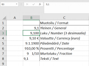 Excel files are called workbooks and their file extension is .xlsx in the newer programs and .xls in the older ones. You should always save workbooks in the new extension form unless there’s a good reason for using the old one. One workbook can contain multiple sheets, which are different tabs in the same file.
In Excel, data elements are located in cells, referenced by the letter of a column and the number of a row. It is crucial to understand the logic of reference. For example, cell B3 with the number of 9100 is selected (active) in the picture on the right. The reference of the selected cell is also displayed at the top in the name box, and the content in the formula bar. Cell B7 has a fractional 9 1/10; Cell C5 has the text Date, and so on. One Excel 2016 sheet can contain up to 16 384 columns and 1 048 576 rows. Thus, if the Excel file contained one person’s basic information in one row, at least six sheets would be needed to store the data of the population of Finland (five and a half million people).
You can select a cell by clicking or navigating to the cell with the arrow keys. However, it is often necessary to select two or more cells at a time. The picture below shows all cells selected in column D, row 4 and 13 and cell area A7:B10.
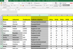
On both Windows and macOS computers you can simply select a range of cells by painting with the mouse. Other ways to select cells are listed below.
- To select a whole column click over the column title
- To selecta a whole row click over the row title
- To select adjacent rows or columns select the first row or column, hold down the shift key and select the last row or column.
- To select individual rows or columns select the first row or column, hold down the control button (ctrl or ⌘), and select the next rows or columns of your choice.
- To select other separate cell ranges select the first cell range, hold down the control button and select the next ranges.
3. Formatting Cells and Cell Ranges
There are basically three ways to format cells in Excel. First, the type of cells’ data, second, the appearance of the cells, and third, the capability to customize the cells can all be formatted. The first two are the most common. Some of the formatting tools are displayed on the Home tab and the rest can be found in the lower right corner of the tool groups by clicking the little arrow (circled in the picture below).
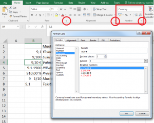
The data type (also Number) tells you how to interpret the data in a cell. You can insert many types of data into a cell – such as different types of numbers, text or dates – that are presented and processed in different ways. A cell always has an automatically generated data type, but Excel doesn’t always interpret the type correctly. The most common error is that Excel interprets the date as a floating point number. In the example above, cells B2:B8 all share the same feed with 9,1 different data types.
You can customize the appearance of cells in many other ways that may be familiar to you with other Office programs. The Alignment tab allows you to define how the content of a cell is positioned in relation to its edges. The Font tab defines the type, style, size, and color. The Border tab defines the border style and position. The Fill tab defines the cell’s background colour.
The last tab is about cell protection. This is necessary, for example, when other users don’t want to be able to (intentionally or accidentally) format certain cells or view formulas. For example, in a small business where employees enter their work hours in the Excel workbook, all cells in the workbook that users dont need to edit should be protected.
4. Entering Data
There are three ways to enter data into cells. First, to enter data select a cell and type. Second, to enter data copy data into a cell by pasting from the clipboard (cache) or by using the fill handle. Third, the data can be derived from other cells by using a formula – This is explained in chapter 5.
Entering data into a cell with keyboard is done either in the cell itself or in the formula bar. In principle, there is no difference between the two, but the formula bar offers more space and the ability to format the content of the same cell in different ways – for example, you can use the formula bar bold the middle word in a three-word phrase or to insert a new line (Alt + Enter) inside a cell.
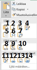 Entering data into a cell by pasting it from the clipboard is done by selecting Paste. This is a frequently used function and there are several options for pasting (picture on the left). The basic option (1) is to paste the contents of the clipboard as it is. If you copy formulas, the relative references will change accordingly. Formulas option (2) pastes a formula only, Formulas and number formats (3) paste the formula and the data type. All using Source theme (4) copies the contents and the format, All except borders (5) does the same but excludes borders. Column widths (6) copies the widths of the column also. Transposition (7) turns a vertical cell range into a horizontal one and the other way around.
Values (8) pastes number values only, Values and number formats (9) include number values and the data type, and Values and source format (10) include layout format. Format (11) pastes only the format with no other content, Paste a link (12) makes an absolute reference to a source cell (e.g. =$B$3). Picture (13) makes a picture of the contents of the clipboard and pastes it, and Picture link (14) links the picture content to the source cell, i.e. it is updated with the source cell.
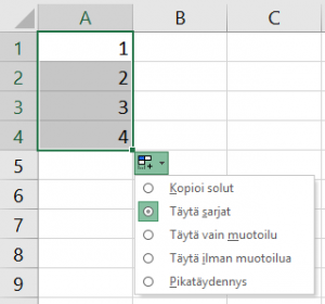 The fill handle is an Excel specialty and very useful for example when creating series and copying formulas. The fill handle is the little square in the lower right corner of the selected cell. By dragging it, new cells are filled based on the data in the original selected area. Auto Fill Options drop-down menu allows you to select which conditions to use to fill the cells (picture on the right). The menu icon appears when you release the mouse button after dragging the fill handle. In the menu you can select: (1) Copy cells, which copies the data of the source cell area into the new cells as it is; (2) Fill Series creates series based on the source cell area, like in the picture; (3) Fill Formatting Only copies only the source format and not the content; (4) Fill Without Formatting copies only the content and not the format. The last option is an automated (5) Flash Fill. The easiest way to understand the meanings of the different options is to test them out.
5. Referencing and Formulas
As noted, cells are referred to by the column letter and the row number: for example, B2, C32 or CA765. There are two types of references: relative and absolute.
Relative cell reference means that a cell is referenced by its relative position. For example, if cell B2 is referred to cell B6, it means ‘same column, four rows lower’ in relative proportion. Relative referencing is the default referencing method in Excel, so no special action is required to implement it. The benefits appear when copying formula contents and references to other cells. For example, it is quite common for a row of cells to have a formula that only applies to that particular data of the row. When a formula is copied to a new row, due to its relative cell reference, it automatically updates itself to apply to the new row.
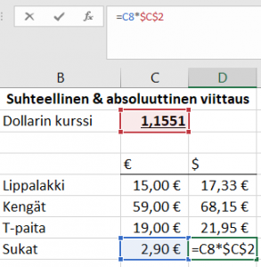 An absolute cell reference always refers to the same cell and is needed, for example, when using constants in a workbook or table. An absolute reference is obtained by adding ‘$’ symbol before the column and/or row name. So when you copy formulas, the reference $X$n always remains a reference to cell Xn. It doesn’t change with respect to the point where the formula is copied.
In the picture on the left, the formula =C5*$C$2 was made for cell D5, i.e. the value of the garment paid in euros was calculated in dollars. The formula was copied to the cells D6, D7, and D8 with the fill handle. The first reference to the formula was incremented by one as the row moved down. Due to the relative reference, the first part of the formula changed to point to the corresponding cells in column C. The second reference, however, always pointed to the constant C2, or dollar rate. Cell D8 was thus copied with the formula (=C8*$C$2) as it were.
Formulas – some of which have already been introduced – start with =. The function of the formulas is to give the response cell the desired result from the contents of other cells by calculating. In the picture below, the sum of the weighing results in a simple formula is calculated for cell L3. Note, that when you activate a formula row in a cell with a formula, all cell references in the formula are color coded from the table. This feature is useful, for example, when checking if all cell references are included in the formula.

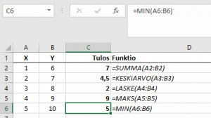 Functions are predefined formulas that can be used either individually or in combination. The most commonly used functions are ‘SUM’ (SUMMA in Finnish), ‘IF’ (JOS in Finnish), and ‘AVERAGE’ (KESKIARVO in Finnish). There are nearly 500 functions in total, and these are described in this Microsoft Support article. The picture on the left illustrates the operation of five common functions; cell C2 has a SUM function that adds cells A2 and B2 – the same result could be obtained by the formula =A2+B2. There’s a function that calculates the mean values of cells A3 and B3 in cell C3. In cell C4, there’s a function that calculates the sum of cells A4 and B4. In cell C5, the MAX function returns the maximum value of cells A5-B5 and in cell 6, the MIN function similarly returns the minimum value of A6 and B6.
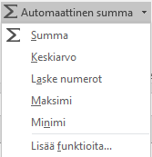 You can enter a function into a cell by clicking the function key (
![]() ) on the formula bar or one of the editing tool options on the Home tab: sum, average, count numbers, max and min functions (see picture).
) on the formula bar or one of the editing tool options on the Home tab: sum, average, count numbers, max and min functions (see picture).
6. Pivot Tables
Pivot Tables can be used to make interactive summaries of other tables. They are very useful when it comes to analyzing large amounts of data, i.e. tables that are difficult to grasp. Quite often, for example, it is necessary to clarify the number of times that certain strings are repeated in relation to each other throughout the table, or how the men and women in the data differ. In business, the general Pivot table use is to produce various reports.
To create a Pivot table select ‘PivotTable’ on the ‘Insert’ tab. In some straightforward cases, selecting ‘recommended PivotTables’ can provide a faster solution. Since Excel aims to draw conclusions about the structure of the table, it is highly recommended that the source tables be in list form – meaning they have a header row and data rows below it. Each column with content should have a header. It is a good idea to delete empty rows before creating a Pivot table, empty cells don’t hurt as much. If the source table format and content are patchy, the Pivot table may be difficult or even impossible to utilize.
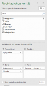 When using the Pivot table tool, the first thing to determine is the data range of which the table will be created. By default, the data range of the entire sheet is activated, which is often a good starting point. The actual Pivot table is created by dragging and dropping fields extracted from the source table (or tables) into four different sections (picture on the right).
Columns and rows are the most unambiguous of the sections: the contents of the fields dragged into them appear in the Pivot table as column headers and row headers. However, the field you intend to use as column headers shouldn’t contain too much content – the maximum is usually 256 columns, which is too large to render the entire table. The ‘filters’ section functions in the same way as filters in normal tables – drag here the field(s) you want to filter data from. The ‘values’ section is perhaps the most interesting, you can do calculations, such as additions, in the field you enter. In the example picture, the sum function is applied to the number of loans (‘Lainojen l[ukumäärä]’ in Finnish, the picture above) field. The importance of sections is best learned by experimenting.
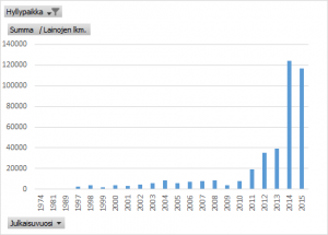
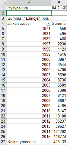 A simple ready Pivot table created with the options described above looks like the one on the left. Originally, a thousand rows table of loan volumes for individual books has been filtered to show Finnish non-fiction (category 84.2) and the annual loan volume. The table view can be customized with automatically created menus, which also work if a chart is created of a table – as shown in the picture below.
7. Instructions Elsewhere Online
Microsoft’s
TAMK training videos: Excel (in Finnish)
Lecture Notes: (in Finnish)
Assignment 4: Spreadsheet Computation I
Assignment 5: Spreadsheet Computation II
Material for Assignment 5
8. Visualization of Data
Generally, data visualization refers to all visual means to improve the understanding of data. In theme II, by visualizing data, we mean, in particular, improving the comprehensibility of tabular data by visual means. These means often seek to emphasize an aspect – such as values above or below a certain threshold, trends in change, or differences and similarities between different data sets. Big amounts of data are being used in different ways in an increasing number of tasks, and improving the readability and comprehensibility of data is a major concern in many workplaces.
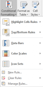 Highlighting cells – conditional formatting. Excel has a versatile and relatively simple set of tools to highlight different types of cell values, namely workbook sheet data. For example, if you wish to highlight cells with a value above or below a given value in the sheet, or to emphasize the relative smallness or magnitude of cell range values, the ‘Conditional formatting’ tool’s ready-made templates (picture on the left) do this. If you need more versatile highlighting rules, you can create your own by selecting New rule.
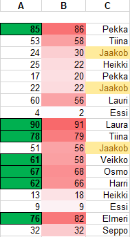 For example, in the table on the right, all cells in column A with a value greater than 60 are highlighted in green, bolded and have borders. This is done by selecting a range of cells, then selecting Conditional Formatting / Highlight Cell Rules / Greater Than…, entering a value (60) and selecting the desired formatting. The column B cells have different shades of red based on how close they are to the maximum value of the cell range (91). This is done by selecting the desired cell range and then Conditional Formatting / Colour Scales… and the desired method. In column C, all cells with the text ‘Jaakob’ are yellow. This formatting is accomplished by selecting Formatting / Highlight Cell Rules / Text that Contains… and entering the desired text.
Basic charts. Basic charts here refer to bar charts, line charts, and pie charts. There are many types of charts and ways to visualize, but in most cases it is appropriate to stick to the basic options. Visualization, of course, also has an aesthetic value and can even be art, but, for example, in a research results presentation, excessive pursuit of specialty tends to impair comprehension and may even be misleading. Simple is often beautiful.
 Charts are created in Excel simply by selecting the data area to enter in the chart – usually including column and row headers – and then selecting the appropriate chart on the ‘Insert’ tab. If the selection is symmetric (equal number of columns and rows throughout the area) and doesn’t include empty cells, creating a chart is usually quite straightforward. Note, however, that the ‘blank cell’ at the top of the row/column headers is smart to include in the selection – as in the picture above, cell A4. If the chart is redundant or the result is undesirable, the chart should be cleaned or rearranged.
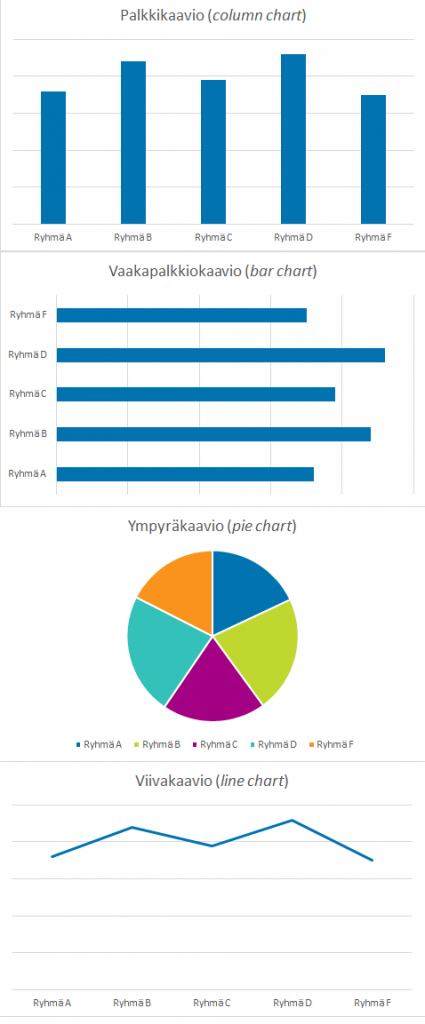 Bar charts or column charts are the most popular of the basic charts. Usually bar charts refer to horizontal bars and column charts to vertical bars. There are several different adaptatins, of which the most used in Excel are the stacked column and the 100% stacked column charts. A traditional bar chart represents a single variable, while a stacked column chart represents multiple variables and a 100% stacked column chart represents the relative share of multiple variables. Bar charts, like other charts, may be 2D or 3D by default but the latter are recommended to be avoided because they are often more difficult to visualize. Bar and column charts are good for depicting the order of values because the bars are left we read them left to right or top to bottom as well as differences in values that are easily distinguishable from the bar and bar charts.
Pie charts are usually used to describe the relative share of variables in an entity, which is often 100%. Pie charts should be used with great caution if not all parts of the entity are included. It is one of the most widely used charts but it isn’t suitable for describing exact differences. For example, in the example on the right, it is easy to visualize different values in all other graphs but in a pie chart it is tricky.
Line charts is the third general chart type and is often used to describe a variable in relation to the time when the time is on the horizontal axis – well-known examples include stock quotes and ECG. The line chart creates an angle between the points and makes it easier to see the trend for change of the bar and its steepness between different values.
More advanced charts include scatter plot, radar chart, and stock chart in Excel. They are not covered in this course.
9. Visualization of Data and Image Processing
Visualization of data is a wide and diverse field and a profession of many specialists. While digital image processing are often not directly related to data visualization, it is useful for anyone working with data to know a few basic tricks to improve the appearance and readability of documents. The tool references presented here are freely available GIMP graphics editor, but the basic principles are the same for other advanced image processing programs such as Paint Shop Pro or Photo Shop.
 Selection. In image processing, editing is applied to all or a part of the image – for example, to a person in the image or to a particular color. Particularly in a photo, it is sometimes difficult to select the area you want, and therefore, there are several tools available for selection and your own menu selection. The tools in the Toolbox (picture on the left) that have to do with selection are: Rectangle Select (1), Ellipse Select (2), Freeform Select (3), Fuzzy Select (4), and Select by Color (5). Rectangle and ellipse selections select the area when you hold down the left mouse button and painting the desired area. You can then adjust the selection by dragging the corners. The free selection is done by holding down the left mouse button and ‘drawing’ over the desired area. Fuzzy selection is often the best choice and especially useful when you want to select an object that stands out from the background – like a red fish on a blue background. The selection is made by clicking the desired area, whereupon GIMP will select all the areas that are similar and linked to the clicked area. ‘Similarity’ is mostly defined by the color value. The method, and its threshold (threshold referring to how easily different areas become similar) can be changed in the tools settings. Experimenting is the best teacher here. The color selection is a bit similar, it selects the color of the image you click. To unselect, click Select / None (hot key: on Windows Ctrl+Shift+A and on MacOs Shift+⌘+A). The selection can be inverted by selecting Select / Invert.
Cropping. The crop tool (14) works by painting over the area you want to include in the image and then holding down the left mouse button. The unselected area is cut off. You can also crop the image by first selecting the desired area and then selecting Crop to Selection in the ‘Image’ menu.
Contrast and brightness are adjusted in the ‘Colors’ menu via the Brightness-Contrast option.
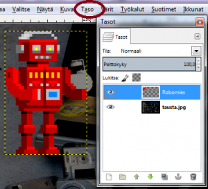 Drawing layers or layers make it possible to construct an image so that its various elements are on their own layers so that they can be individually modified. This is very useful in even moderately advanced image processing. For example, when you are creating collages, it is best to paste the image as layers by selecting Edit / Paste as / New Layer. For example, the image on the right has two layers – ‘tausta-jpg’ and ‘Robomies‘, which is selected. All customization actions are now restricted to the robot layer. You can use the ‘Layer’ menu to resize, rotate and apply different effects.
The most common file types for digital images are .png, .jpeg (.jpeg), .gif, .bmp, and .tiff. In most cases, it is wise to save the images in either .png or .jpg format. GIMP’s own file type is .xcf and is only used during editing – once the image is complete, it is saved in the desired format (file type) by selecting File / Export as and the desired a name and file type.
10. Instructions Elsewhere Online
Tutorials in Finnish:
- Aki Taanilan menetelmäblogin visualisointipaketti.
- GIMP Suomi -nettiyhteisö, sisältää mm. oppaita.
- Opi GIMP -nettisivusto.
Lecture Notes:(in Finnish)
Assignment 6: Visualizing Data
Material for Assignment 6
